Here is my finished logo. I suppose, if I had done packaging the front would look something like this, slipped in under a DVD cover.
Tuesday, October 20, 2009
Tuesday, September 29, 2009
brand development design process
Not that it's hard to tell, but I'm really bad with logos. I can never get them looking right, and I think I either try too hard or not enough.  These were my initial ideas on my brand name, and after realising I was putting too much effort into it, I stepped back and thought about video store chain logos. The colours, the fonts, the styles, it was all about big, bold colours and letters. Working off that I went with this:
My process from then on was to make my products. For my video store I immediately wanted to do a Membership Card, along with a Business Card, a Store Poster and I went with a letterhead as my final one.
 This is my Membership Card. I have a Membership Card from Junee's video store and it was all a solid blue colour. The same with my mum's Civic Video card, so I wanted just a solid colour for this. There's not much to it really, I just wanted to keep it simple. I also designed a little video casette, just to blend in with the image. Luke suggested I place spools in the sides of the tape, but I didn't for two reasons. One: I couldn't get it looking right, (I'll post the one with the spools later sometime) Two: I wanted the image to stay simple, and with the spools there, it seemed to bring the image from the background to the foreground too much.
  This one now is my Business Card. To not repeat the same look as the Membership Card, I did this one white and orange, just to have it stand alone from my other product. Luke helped me fine tune the text and showed me how to make certain parts of the card stand out, ie: the white bold text, which he orignally had as yellow, but I felt the white made it less glarey and helped it blend better but still stand out as important information. I could picture these bad boys sitting in one of those card thingies on the counter, ready for the taking.
 Now this is my letterhead. There's not much I can say on this, I just kept the Business Card colour style for this, because I felt having the bar of orange run across the page, sort of made things look just that slight bit more official, along with clean, tight font to bring it on home.
 And lastly we have my store poster. You know those big ones that repeatedly hang across the front windows of video stores. I just plucked a bunch of the latest releases from the Video Ezy, Blockbuster and Civic websites. I went back to the Membership Card colour scheme for this one because I felt I needed a heading feel to the page, which grabs your attention and draws your eye down the page, particularly focusing on the orange type on white off-centered above the movies.
These were my initial ideas on my brand name, and after realising I was putting too much effort into it, I stepped back and thought about video store chain logos. The colours, the fonts, the styles, it was all about big, bold colours and letters. Working off that I went with this: I went with a few different styles, such as working on colour or white, and I tried using black and white fonts, with things like black and white outlines or not. When I felt I had developed one that I liked, I went with it. (First Column, 3 from the bottom).
My process from then on was to make my products. For my video store I immediately wanted to do a Membership Card, along with a Business Card, a Store Poster and I went with a letterhead as my final one.
This is my Membership Card. I have a Membership Card from Junee's video store and it was all a solid blue colour. The same with my mum's Civic Video card, so I wanted just a solid colour for this. There's not much to it really, I just wanted to keep it simple. I also designed a little video casette, just to blend in with the image. Luke suggested I place spools in the sides of the tape, but I didn't for two reasons. One: I couldn't get it looking right, (I'll post the one with the spools later sometime) Two: I wanted the image to stay simple, and with the spools there, it seemed to bring the image from the background to the foreground too much. This one now is my Business Card. To not repeat the same look as the Membership Card, I did this one white and orange, just to have it stand alone from my other product. Luke helped me fine tune the text and showed me how to make certain parts of the card stand out, ie: the white bold text, which he orignally had as yellow, but I felt the white made it less glarey and helped it blend better but still stand out as important information. I could picture these bad boys sitting in one of those card thingies on the counter, ready for the taking.Now this is my letterhead. There's not much I can say on this, I just kept the Business Card colour style for this, because I felt having the bar of orange run across the page, sort of made things look just that slight bit more official, along with clean, tight font to bring it on home.And lastly we have my store poster. You know those big ones that repeatedly hang across the front windows of video stores. I just plucked a bunch of the latest releases from the Video Ezy, Blockbuster and Civic websites. I went back to the Membership Card colour scheme for this one because I felt I needed a heading feel to the page, which grabs your attention and draws your eye down the page, particularly focusing on the orange type on white off-centered above the movies. Tuesday, September 8, 2009
movie logos?
My main ideas for this company we're designing was for a cafe (The Burger Bar, Mocha-Lotta-Latte, Chowdown) or for a softdrink (Fresh, Carri, Posse, View). Then, I thought of a movie store and began to work with that idea. With a few ideas bubbling around, I made a basic logo with the colours I thought I might use and try out the different names of my company.  In the end I went with Cinebest, and tried out some different fonts with the design next.
In the end I went with Cinebest, and tried out some different fonts with the design next.
Tuesday, August 25, 2009
Aidizzle Posters
Here are my posters for Luke. The first one I did, I had in mind a giant rap concert, like one of those ones to raise money or something. But I couldn't make it turn out the way I wanted it to, and so worked closer in design to my album, like a promotional poster for the album's tour. Here they are: 

CD Case
Here are a few snapshots of my first album as Aidizzle, beginning his Get the Motor Running tour in October.


Different Logos
Here we have the ten different logos we had to do for Luke's class. In order they are a:
-Freight Company
-Piano Manufacturer
-Music School
-Body Piercing Studio
-Tattooist
-Architect
-Florist
-Adult Entertainment Store
-Skate Shop
-Surf Shop
I relied a lot on different fonts and colours to give my logos the right feel. I don't know how correct that is, but it involved a lot of tweaking before I was at least 75% happy with them.

Tuesday, June 23, 2009
My Composites for Luke
Composite 1- Land of the Giants


For this composite my vectors are the Platypus, the Meerkat and the Crane. For this image I wanted something slightly sinister, but in a docile or calm representation. To me, the unintentional damage that massive animals could create would be disasterous, but people would still flock to the see them. The fact they appear to be in a theme park could be like a Jurassic Park-esque response.

Composite 2- Treat Your Mind Like a Bad Neighbourhood, Never go There Alone
This composite I wanted to be threatening. My vector is the large open fire and loungeroom that the girls see before them. People that viewed this one did not understand it straight away, so hopefully I explain it enough here. I made the room very hazy and warm, but also slightly intangible, due to it only being an illusion, sort of acting as a metaphor to the warmth the lost little girls feel being with each other in this bad street.
Composite 3- The Grass is Greener on the Other Side
This one was extremely simple, however, I couldn't really think of anything more in-depth without carrying across the same sort of message. To me, this saying accompanies many people who are on the greener side, but do not know that they are, so in this I wanted to make sure that the view was defiantly showing the greener side, but a barred greener side. I intended for the a solid contrast between the dark and twisted wire fence, compared to the nice, lush and sunny side of the hills and the sign. The only vector in this image is my large sign behind the wire.

Composite 4- LOVE/HATE
To me, love and hate is all about contrast. Two opposites at the end of the spectrum, and for some bizarre reason I got the idea of doing this whole contrasting image with the sun and the moon. This involved placing the sun in a cloudy night sky against the moon in a sunny bright sky. The sun and the moon are the vectors in this image, and I decided to keep making it as opposing as possible by placing the two words on each star, but then gave them the opposite reflection, just to continue on with that reoccurring them as much as possible.
Composite 5- How the West was Won
Cowboys! That's exactly what I thought of when that sentence was said. I wanted a big epic cowboy gun fight, but I didn't exactly know how I could do it to pull off an effective image that also involved vectors. Then when Luke told us about taking our own photos for these composites, it just flashed to me that our class would be my cowboys, and I could vector their bodies! Weird, I know, but I'll take the epic design ideas where I can get them. So, long-story short, I got certain classmates permission (thank you very much!) and stuck their heads and poses onto vectored cowboy bodies. To finish off the photoshop effects I placed shadows, gunshots and a cepia-tone over the whole thing, just to finish off that ol' western feel. Yeehah!
Tuesday, April 7, 2009
Indian Pattern
Not the half-naked kind, the kind from India. I think I'll have to explain this one, because right now, looking at it, it doesn't exactly give off an indian vibe to me.
Vermillion is like one of their most treasured colours. Not only does it symbolise enlightment, wisdom and beauty, but it also used for those little dots on their foreheads (I guess that's the whole enlightment , wisdom thing).
Orange is also a favoured colour, with a majority of male turbons and women's clothing featuring the colour. The more orange someone has on their body, the more higher up they are supposed to be in the world. That's why it is honourable for a man to have bigger turbon, because if it is orange it is very respective of their position.
Cobalt blue is also an important colour, featured as the second colour found on turbons. Cobalt blue also means wisdom and guidance, which is why the men wrap it around their head. But, originally having the smaller circles cobalt blue didn't look right to me, so I changed it to Persian Pink, which is a very feminine and woman's colour, much like how it is stereotyped in our culture. Persian Pink is said to be very attractive and it is not uncommon for Indian ladies to wear it on their wedding day.
Bit of a long explaination, but I got there. I'm betting though that no-one even bothers to read this...so...here's my pattern...

Ferrari
I have no idea what kind of Ferrari this is, I'm not the best with types of cars and the site wouldn't tell me. Meh...life continues...

Wednesday, April 1, 2009
Monochromatic Pattern (mouthful)
Here is my mono-pattern. It looks very bubbly.
Um...dunno what else to say really. Nice weather we're having...

Tuesday, March 31, 2009
PATTERNS!!!
Here are the patterns I did for Nathan. I threw in the last one just as my means of experimenting, although to my credit I did use two dissonant colours, I just didn't stick to two solid colours.


My Character
I know it isn't much but this is my character I had to do for Luke. The reason I did this character...here goes life story...
Is because it' me... see, back in High School, me and my friends each designed a character. Not exactly us, we could change them however we wanted (as you can see my dude's blonde) and because I could draw I wacked them together into a comic I've been drawing for a year.
So basically, that's it. I decided I was going to do him in Illustrator for a change because I edit the comic in photoshop. This is one of his shots in the comic and I don't have the original sketch on me, but it will be up here at some point.
Tuesday, March 24, 2009
Combined Images
Long overdue I have up the image in photoshop that we did with Luke a few weeks back, the one how we had to combine five different images into one. The kitten, because it was so fuzzy and hairy, is cut out horribly, but meh, I don't really care. And the robot was atrocious to do mainly because I'm now used to using the pen tool in illustrator...
I know it's a little hard to see on my blog, but clicking on it will bring up a bigger image.

I know it's a little hard to see on my blog, but clicking on it will bring up a bigger image.


Illustrator
Here is the mighty Parramatta Eels. This one got posted before the two we did last week because they are currently on the macs. Hopefully, they will be up soon.

Tuesday, March 10, 2009
Typography
Typography. Without having looked up anything on the topic yet, I would say that typography is the use of symbols and shapes to convey a message. I'm just thinking how fonts can appear in all different styles, but typography isn't just limited to text, typography could maybe refer to images and pictures that convey the same messages as typography. It can also be stylised, like graffiti for an example.
Okay. Wikipedia lists typography as 'the art and techniques of aranging type, type design and modifying type glyphs.' Sounds fun. Thank god I did more research then just a glance at Wikipedia, which goes on to talk about the kerning, tracking and leading of typography font.
Firstly, I want to link to Sagmeister.inc, because their designs and site are awesome. Really look through their works and read what they are about because it is really appealing.
I also went to David Carson's website, which I had oddly been to before, I'm not sure but didn't Karen get us to look him up? I didn't like his style as much as Sagmeister, but it still brought across a pretty good message. Like his 'Yes series', showing how an image can be changed just by the altering of font alone.
To me, good typography is typography that suits its environment. It's a hard question in my opinion, and no matter how many websites I visited the answer didn't get any clearer. It needs to convey its message, not only creatively and effectively but in a way that appeals to its purpose, design and most importantly the audience.
I don't know if I can explain it any different, but hopefully that'll do.
Tuesday, March 3, 2009
one more...
 As Nathan was talking about different colours for same images, I thought it would be different to use a few colours to spice up my spliced up image. I don't know if it's the abstraction or the strange imagination that I possess, but i'm thinking of genies when i look at this picture. Anyone else? No? Oh well...
illustrator tasks
 This is one of my compositions we had todo with our 4 shapes and 3 lines. Basically, to get as abstract as I possibly could, I placed my shapes and lines in alternating black and white colours and blended them all with twirls and swirls. Depite it being...very...whatever it is, I like it. It's coz it looks like some evil shadow coming to get someone.
 This is one of my compositions with just the 4 shapes and 3 lines we had. It doesn't really have anything going for it, but i like the sun-like orb at front. I have no idea why...
 This is my illustrator city, the one how we had to make a composition with just squares and lines.
hello out there!
um, dunno if anyone is viewing my profile or not. if u aren't, u r more intelligent that the person reading this, and if u r... why?
oh well, if u've put in some effort to view my bloggie thing i may as well say something...
...
...
...i showed u mine, so u show me ur's. lol, innuendo.
oh well, if u've put in some effort to view my bloggie thing i may as well say something...
...
...
...i showed u mine, so u show me ur's. lol, innuendo.
Tuesday, February 24, 2009


Wednesday, February 18, 2009
Six Photos that follow the Rule-of-Thirds
http://www.wta.org/trail-news/photo-contest/2009-contest-winners/rule_of_thirds_brenner.jpg this is the first of my rule of thirds shots. It looks pretty beautiful to me, and the grid is already drawn up on it.
http://www.photoanswers.co.uk/upload/5661/images/rule%20of%20thirds.jpg also another beautiful shot of an open storm. I love how the lone tree pretty much lines up perfectly on the grid intersection.
http://globalwholesaleart.com/southern-plantation-porch-p-6140.html i couldn't get the rights to view this one any bigger. I liked in this shot how the off-centre frame of the house pretty much lines up with the grid itself.
http://www.chinaoilpaintingswholesale.com/pictures/Landscape/pic1/b/Landscape21.jpg this one was also a good painting, that I thought followed the grid well. To me the pool lines up not only on one of the intersections, but then follows the grid lines out.
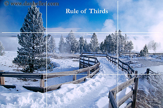
http://www.danheller.com/images/FAQ/Tech/rule-of-thirds-3-big.jpg i don't know if I can see the rule of thirds on this image and all, with those big white lines all over it.
http://www.photocritique.us/images/example_rule_of_thirds.jpg to me, this is a cool image, and may not follow the rule of thirds to a T, but i believe it to be a really good photo. However, this is coming from about negative 3 years of photography in my experience, so I'm probably right off the point.
http://www.photoanswers.co.uk/upload/5661/images/rule%20of%20thirds.jpg also another beautiful shot of an open storm. I love how the lone tree pretty much lines up perfectly on the grid intersection.
http://globalwholesaleart.com/southern-plantation-porch-p-6140.html i couldn't get the rights to view this one any bigger. I liked in this shot how the off-centre frame of the house pretty much lines up with the grid itself.
http://www.chinaoilpaintingswholesale.com/pictures/Landscape/pic1/b/Landscape21.jpg this one was also a good painting, that I thought followed the grid well. To me the pool lines up not only on one of the intersections, but then follows the grid lines out.
http://www.danheller.com/images/FAQ/Tech/rule-of-thirds-3-big.jpg i don't know if I can see the rule of thirds on this image and all, with those big white lines all over it.
http://www.photocritique.us/images/example_rule_of_thirds.jpg to me, this is a cool image, and may not follow the rule of thirds to a T, but i believe it to be a really good photo. However, this is coming from about negative 3 years of photography in my experience, so I'm probably right off the point.
Tuesday, February 10, 2009
i have no idea what im doing
i've never created or read a blog in my life, so this is... dunno, different.
The point of a blog, is it really just to type about something?
Just seems a bit random and opinionated to me.
The point of a blog, is it really just to type about something?
Just seems a bit random and opinionated to me.
Subscribe to:
Posts (Atom)